Visual strategy and identity
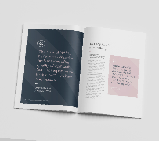
Withersworldwide, renowned for their philanthropy and responsible business practices, approached us to refine their identity and develop a cohesive visual strategy. Our goal was to enhance the brand while simplifying management for their global marketing team.
A key aspect of our project was understanding and establishing a clear brand architecture. We began by revamping their firm-wide materials, creating a distinctive visual language through the use of patterns, typography, and warm photographic styles. This was complemented by a versatile colour palette, ensuring flexibility across all facets of the business.
Next, we extended this visual language to their sector-specific, practice-specific, and employer brand materials. Each segment was given a unique look and feel, while seamlessly integrating into the overall Withers brand style.


